Mindshare, Inc.
Power Out of the Box
Transforming a Linux laptop brand to stand out in a crowded, high-performance market
Project
Kubuntu Focus Product Branding
Roles
Creative Direction
Brand Strategy
Identity Design
Visual Design
Content Development
Objective
Initially brought in to redesign the Kubuntu Focus website ahead of a key product launch, the engagement quickly revealed a broader opportunity. While the platform delivered a high-performance Linux experience, its identity did not reflect the product's technical strength or premium aspirations, particularly when seeking to attract new market segments. A refreshed brand identity would strengthen customer confidence and signal a more effective market presence by improving brand recognition, clarifying positioning, and reinforcing alignment with its open-source partner, the Kubuntu OS (KOS) brand.
Solution
The new identity established a more distinctive brand presence for Kubuntu Focus while strengthening its partnership with the open-source KOS user community. Custom letterforms, developed using proportions from the original symbol, resulted in a modern wordmark that balances familiarity with a confident, forward-looking tone. Refined typography improved clarity and scalability across digital touchpoints. At the same time, the broader visual system positioned Kubuntu Focus as a credible premium alternative in the Linux hardware space and a viable contender in the broader Mac and PC market.

Starting Points
The Kubuntu Focus product line, developed by Mindshare, Inc. in the San Francisco Bay Area, was designed for high-performance Linux users (engineers, developers, scientists, and discerning prosumers) who demand power, speed, and reliability.
As Kubuntu Focus looked to expand its reach and convert users from Mac and Windows platforms, the need for a more refined, credible brand became essential. The promise of open-source freedom, combined with purposeful engineering, called for an identity that could instill confidence, stand shoulder to shoulder with established hardware giants, and reflect the clarity and discipline built into the user experience.

Wordmark Construction
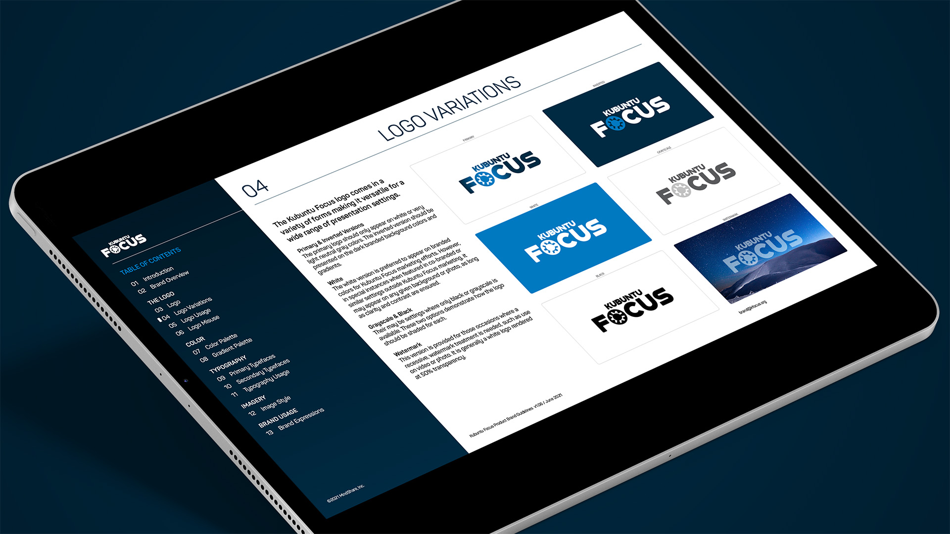
Given Kubuntu Focus’s leadership role within the KOS community and ecosystem, and its close collaboration with the Kubuntu OS team, the strategic decision was made to retain and reframe the iconic KOS logomark within the new identity. Rather than treating the symbol as a standalone element, it was integrated directly into a bespoke wordmark. Custom letterforms reflect the KOS mark’s proportions, creating a unified, future-ready logo that reinforces platform continuity and signals a confident, modern brand direction.


Brand Guide

“Thanks to his insight and execution, we exceeded our short-term goals and are prepared to meet future challenges with confidence. Chip’s attention to detail and reliability is unsurpassed. He collaborates fully with multi-disciplinary teams and always produces a thoughtfully conceived and professional product.”
Michael Mikowski
Founder
Kubuntu Focus
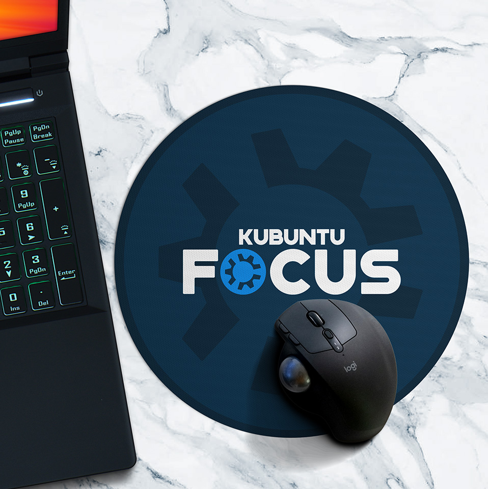
Brand Activation


Start screen featuring the Kubuntu Focus Quick Help Widget


Motion logo video intro bumper
©2026 Chip Taylor. All rights reserved.
©2026 Chip Taylor. All rights reserved.
©2026 Chip Taylor. All rights reserved.
©2026 Chip Taylor. All rights reserved.
©2026 Chip Taylor. All rights reserved.