Informatica
Simplifying Cloud Data
Refreshing a 28-year-old enterprise cloud data brand to invigorate a new era of customers
Project
Informatica Brand Refresh
Agencies
EDP, Inc. (San Mateo)
CG Creative Studios (San Diego)
Roles
Creative Direction
Brand Strategy
Visual Design
Content Development
Objective
After a successful 2019 rebrand, Informatica's visual ecosystem began to aggregate elements from a series of high-performing campaigns. By 2022, leadership recognized the need to audit the brand, clarify what resonated, and unify the strongest elements into a scalable system. In a category converging on the same clean, generic enterprise aesthetic, the opportunity was to build something genuinely confident and distinct.
Solution
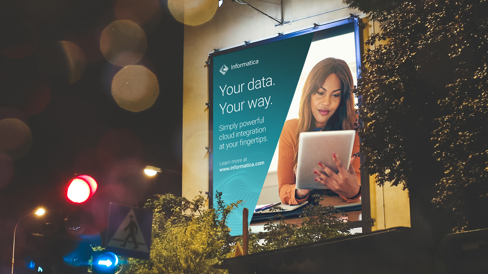
Partnering with Informatica’s senior marketing leadership, I led a top-to-bottom audit of campaigns, brand assets, and visual signals. From this, I orchestrated a new design system that honored the foundation while elevating the brand’s emotional and narrative resonance for a younger, cloud-native customer base. The refresh was captured in new brand guidelines and used to reassert the company’s identity across every touchpoint, from global events to social campaigns.

Informatica Brand Guide

Brand Elements


Primary colors

Secondary accent color palette

Photography as Brand Storytelling
To humanize an abstract value proposition, I helped design a flexible image system rooted in three emotional narratives:
Beholding the Invisible: visual metaphors for data in motion, evoking insight, order, and possibility beneath the surface.
Achieving the Extraordinary: architectural and atmospheric scenes that signal ambition, scale, and precision.
Experiencing the Unprecedented: real-world snapshots of impact, highlighting breakthrough moments across industries like retail, energy, and healthcare.

Product features illustration style

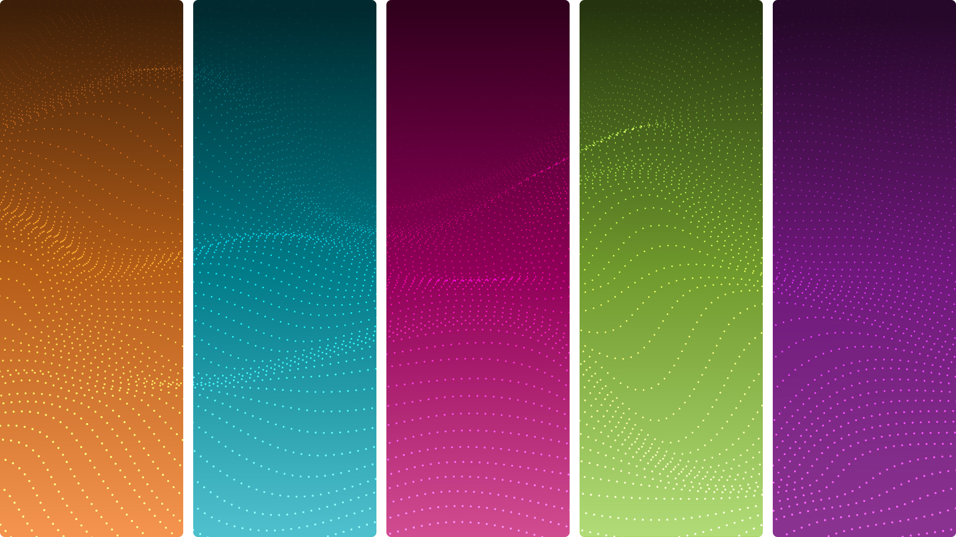
"Data wave" graphic element rendered on gradients spectrum
Brand Activation


Informatica World™ Logo
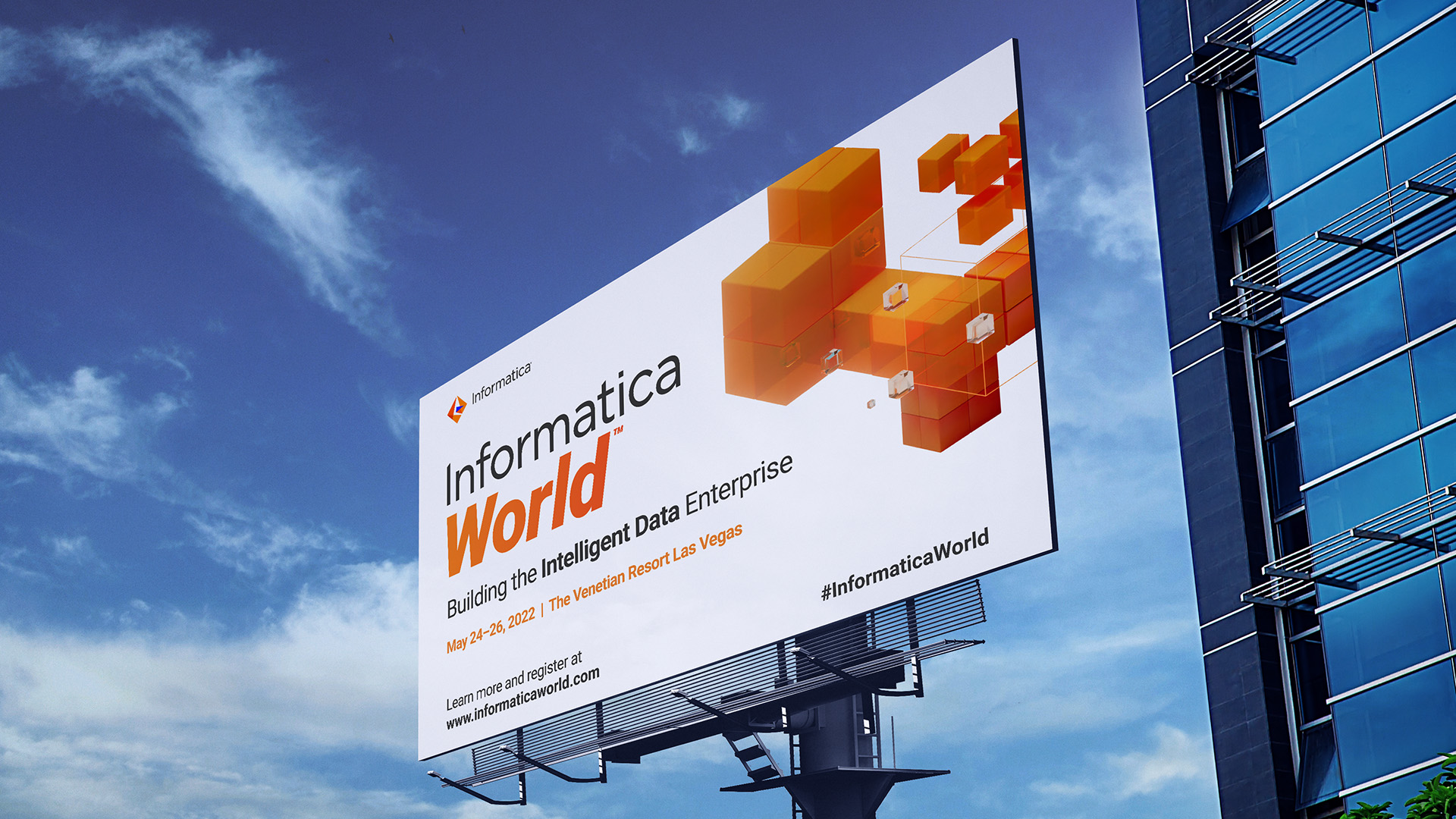
As part of the broader brand refresh, I reimagined the identity for Informatica's annual developer conference. In previous years, the event logo used a simple typographic lockup that was updated annually with the event date. For 2022, the team chose to retire the date-specific format in favor of a timeless, reusable logotype that could stand apart while staying connected to the core brand.
The final mark expanded on the Informatica wordmark with a bold variation tailored to the event. It captured the conference's energy and future-facing spirit while maintaining visual alignment with the parent identity. The result offered long-term flexibility across channels, campaigns, and event materials, reinforcing brand continuity without creative constraint.


©2026 Chip Taylor. All rights reserved.
©2026 Chip Taylor. All rights reserved.
©2026 Chip Taylor. All rights reserved.
©2026 Chip Taylor. All rights reserved.
©2026 Chip Taylor. All rights reserved.


