
Viva Ventana
Elegant Adventures Await
Reinventing the brand experience for a Baja California-based boutique adventure resort and spa
Project
Playa Ventana Brand Identity
Roles
Creative Direction
Brand Strategy
Visual Design
Content Development
Messaging Strategy
Objective
Playa Ventana set out to expand beyond its core windsport audience and attract travelers seeking luxury, wellness, and curated experiences. The goal: elevate the brand’s visual presence without losing the elemental energy that defined its adventurous roots. It needed to signal both quality and calm, offering an immersive hospitality experience with soul.
Solution
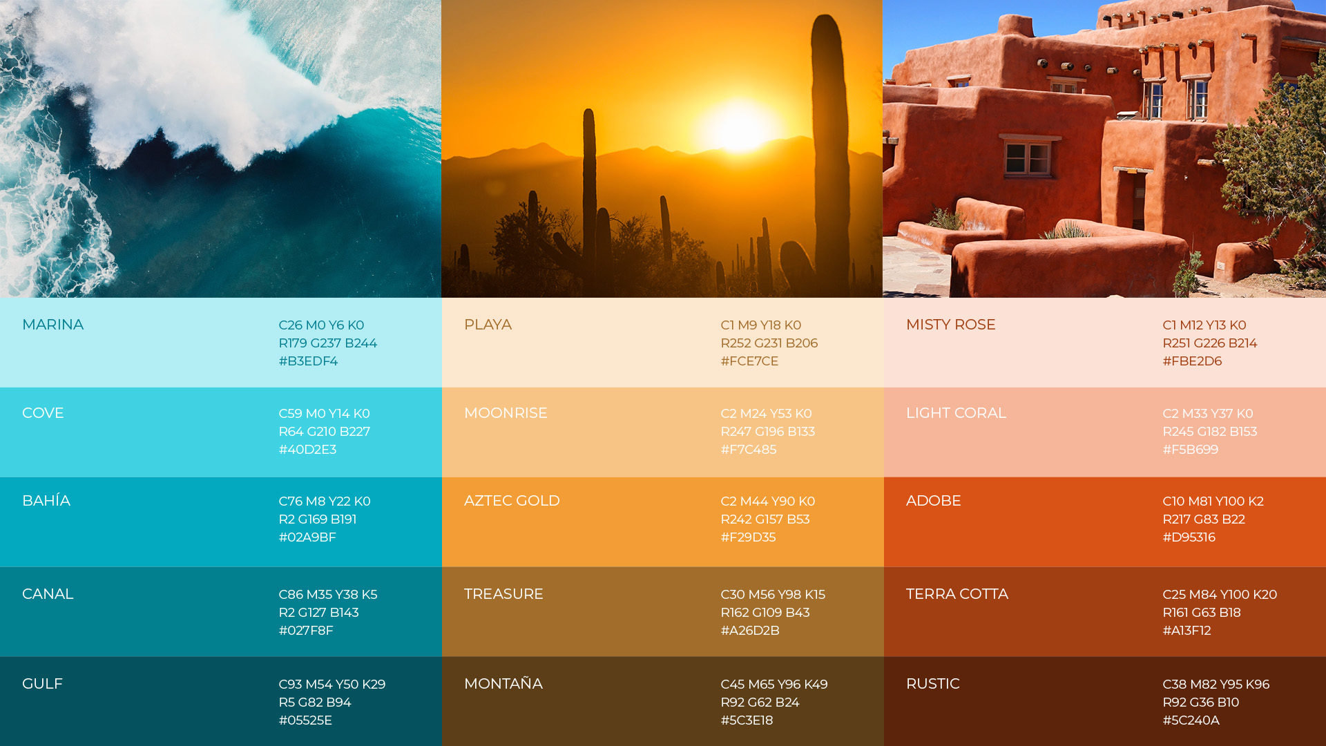
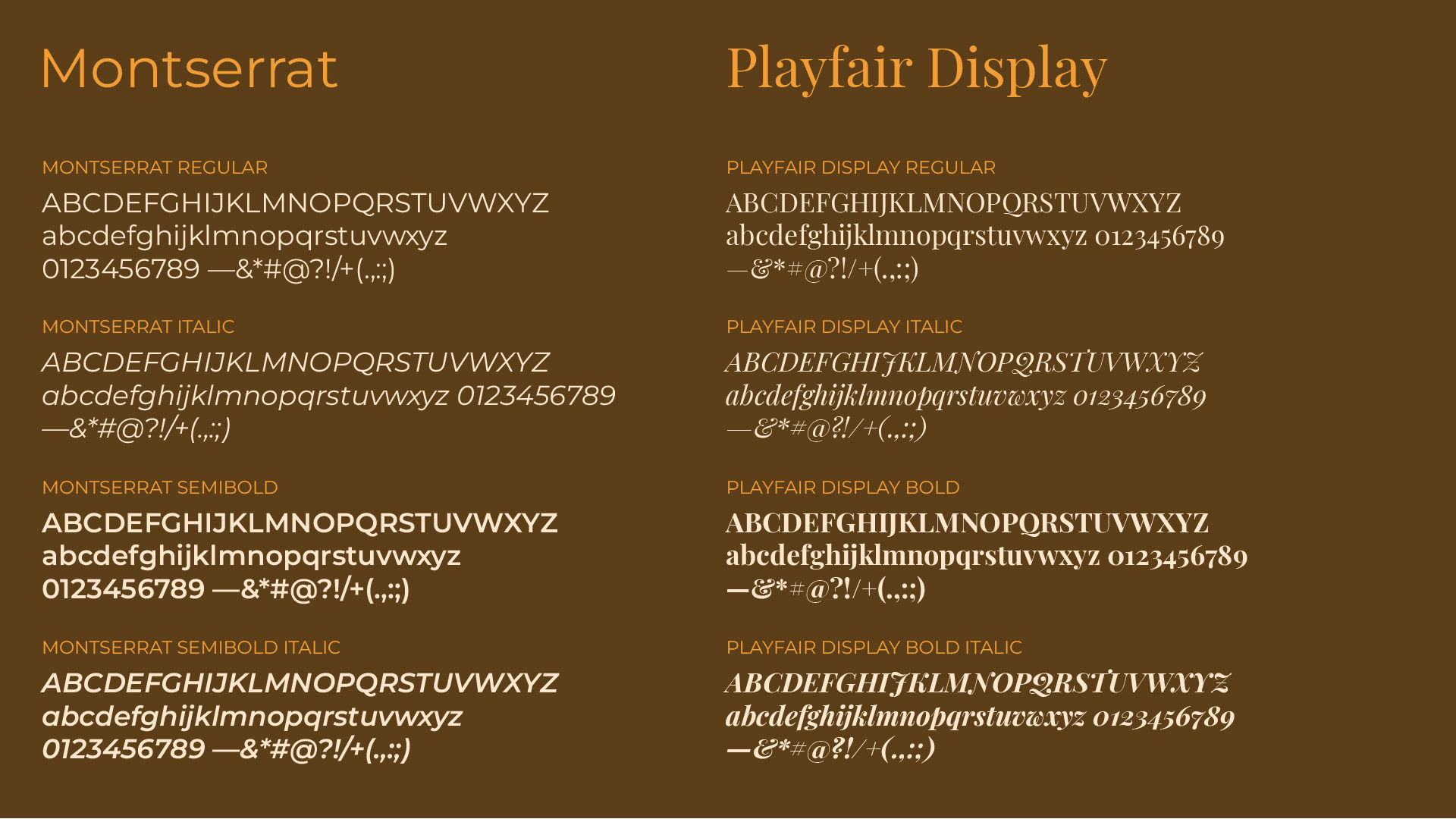
I positioned the brand around the notion of adventure with a quiet spiritual heart, a sensibility that speaks to both legacy and aspirational guests. The refined identity balances classic and contemporary elements: a custom serif logotype, a jewel-toned color palette, and elegant supporting visuals. Every detail was designed to resonate with a more discerning traveler, while preserving the authenticity of the resort’s wind-driven roots.

The Story of the Solar Rose
During early discovery, the owners shared a personal inspiration: the operculum shell. On their first visit to the region, before founding the resort, they discovered one in the sand and were drawn to its distinctive spiral and quiet beauty. That fond memory became central to the design brief.
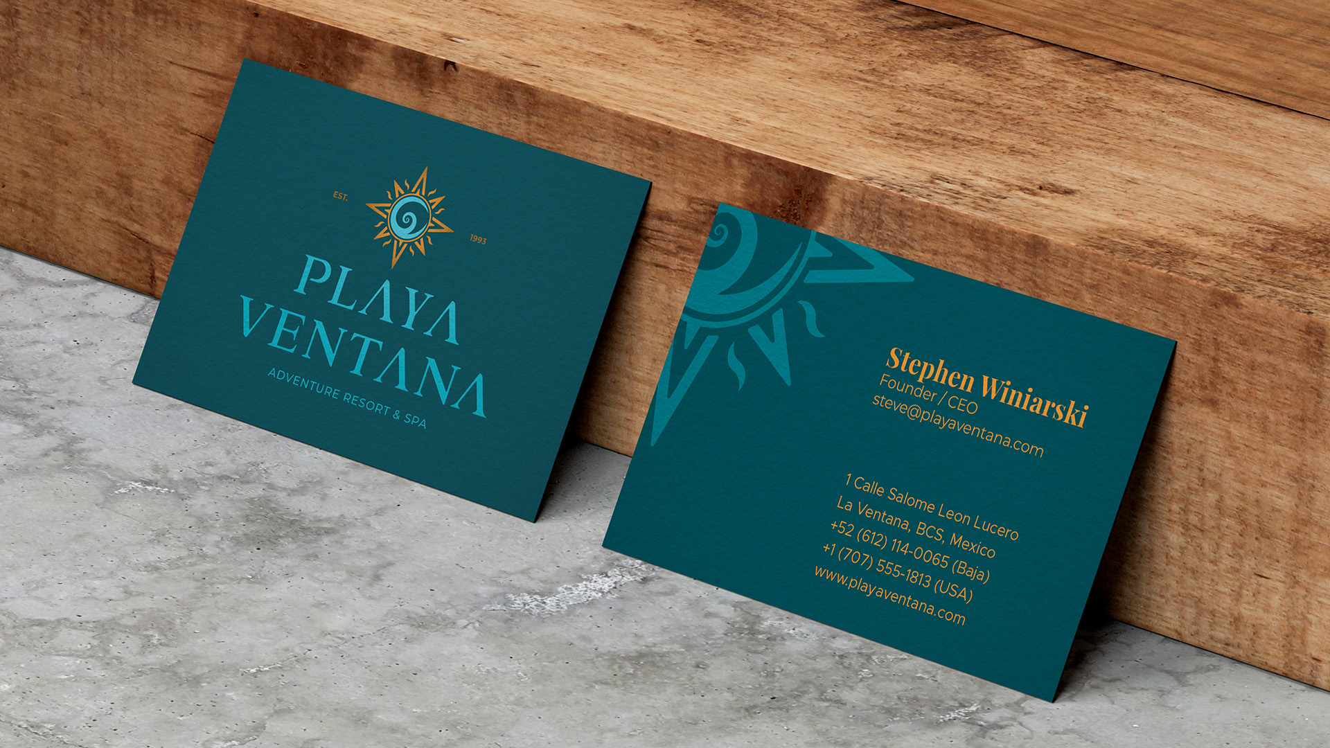
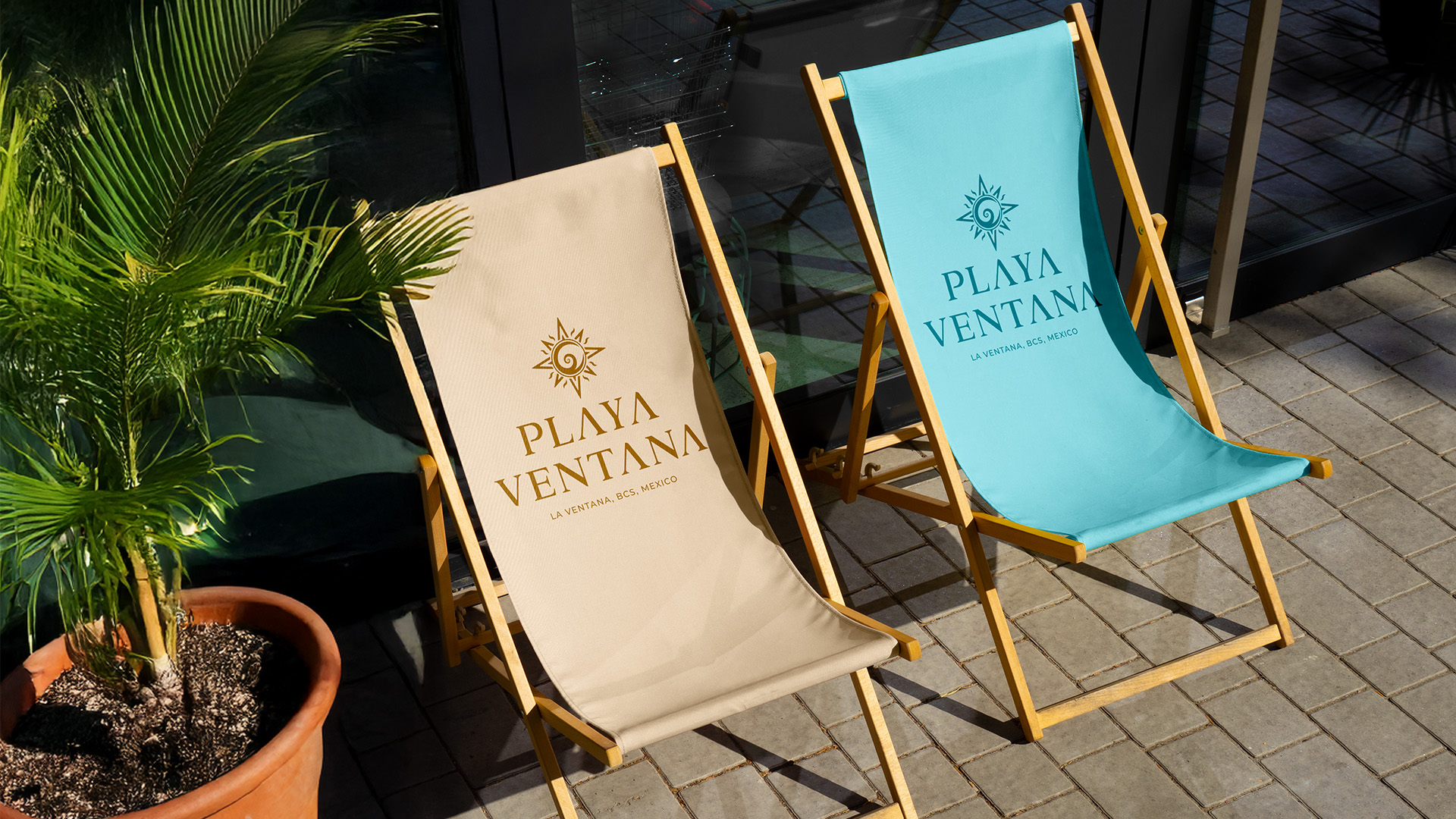
To evolve the form into a more layered and symbolic glyph, I augmented the spiral with elements of a wind rose (a nod to adventure) and solar rays (to evoke warmth, energy, and light). The result was a logomark grounded in memory and radiant with possibility. Affectionately named The Solar Rose, it became a signature brand asset woven into hospitality accents, collateral, and marketing materials.

Visual elements of the "Solar Rose" logomark



Brand Activation




A New Name, Same Spirit
Following the launch of the Playa Ventana identity, the client chose to rename the resort Aqua Ventana to better align with future growth plans. They re-engaged me to update the entire brand system with the new name, retaining all other aspects of the visual identity, messaging, and brand strategy shown here. The work is currently in use under the new name. The transition was seamless, preserving the integrity of the original design while aligning with the new name.
Visit: www.aquaventana.com
©2026 Chip Taylor. All rights reserved.
©2026 Chip Taylor. All rights reserved.
©2026 Chip Taylor. All rights reserved.
©2026 Chip Taylor. All rights reserved.
©2026 Chip Taylor. All rights reserved.